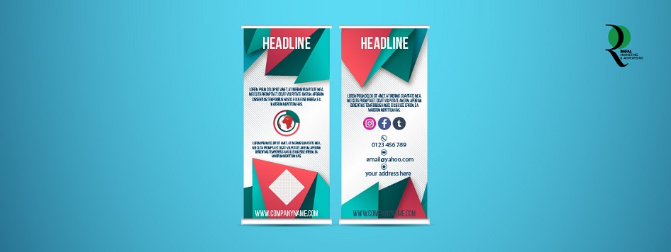
The Role of Typography in Rollup Standees Design
Bringing potential customers in the competitive market of today calls for effective use of visual communication. The rollup standee is one of the best tools available to businesses; it's a highly visible, flexible, and portable way to advertise goods, services, and events. Typography is one of the most essential elements of a successful roll-up standee. Creating a lasting impression and effectively conveying your message can be achieved by selecting the right font. This blog will discuss the role of typography in rollup standee designs, especially in Saudi Arabia cities like Dammam and Riyadh, and how companies may use it to make a statement.
The Importance of Typography in Design
Typography is the art of ordering type to make written language fair, readable, and visually appealing. It goes beyond the style and appearance of text. When it comes to rollup standees, typography serves as the connecting thread between other design components including branding, messaging, and graphics. Well-considered typography can enhance the message and increase engagement, whereas poorly chosen fonts can result in unintelligible text and undermine the standee's goal.
Creating Impact with the Right Font
The choice of typeface is the first typographic decision in the design of rollup standees in Dammam or Riyadh. Your brand identity and the message you want to get across should be reflected in the font type you select. For example, tech-related firms might benefit from a sleek, modern typeface like Helvetica or Arial, but formal events or institutions might benefit more from a more classic font like Times New Roman.
Selecting the proper font size is also very important. Rollup standees are often seen from a distance, thus the text must be readable at a size that doesn't overpower the design. For the primary headline, a minimum font size of 85–100 points is advised, and depending on the overall design, related content can have a font size of 40–50 points.
Readability and Legibility
Legibility is crucial when creating roll-up standees, especially for outdoor events like Dammam or shows in Riyadh. It should be easy for visitors to take in the message from your standee without squinting or straining too much. Because they are very readable, sans-serif typefaces like Arial, Calibri, or Open Sans are often used.
Make sure there is adequate contrast between the wall color and the text as well. Legibility is improved, for example, when dark text is used against light backgrounds or vice versa. Stay clear of backdrops that are too cluttered since this could make the text difficult to read.
Hierarchy and Visual Flow
Creating a visual hierarchy is helped by typography. This means making sure the most crucial information, such as your headline or main point, is the most visible. In terms of value, body text and subheadings should come after. The hierarchy of the typography makes it possible for viewers to scan the standee fast and focus on the most crucial information first.
A well-organized hierarchy can be crucial for drawing attention to rollup standee designs in Riyadh, where events tend to be fast-paced and high-energy. The viewer's attention can be guided and the message can be better retained by using bold, capital fonts for the primary headline and subtle, lowercase fonts for extra details.
Spacing and Alignment
Leading and kerning—the distance between lines and letters—are crucial components of your rollup standee's overall design. Text might be difficult to read if there is too much or too little space between letters. Appropriate spacing enhances readability and gives the design a more harmonious, visually appealing appearance.
Another important consideration is alignment. While left alignment is usually better to read for longer paragraphs or lists, center alignment is best for brief, strong statements. The rollup standee has a polished appearance by lining all of its pieces evenly.
Using Typography to Reflect Brand Identity
Your overall branding should be reflected in the typography on your rollup standee in Dammam or Riyadh. Your logo, website, and other marketing materials should all feature fonts that are either the same or complementary to the ones you use on your rollup standees. Typographic consistency is important for building brand recognition, which is vital for businesses seeking to stand out in tough markets like Riyadh and Dammam.
In conclusion, It is impossible to overstate the value of typography in rollup standee designs. It provides a basis for properly relaying your message and boosts the overall visual appeal. Keep in mind that font choice, size, spacing, and alignment are important components that can either strengthen or weaken your message while creating rollup standees in Dammam or Riyadh. Businesses can make sure that their rollup standees are not only eye-catching but also meet their goals to boost engagement and deliver a strong message by carefully evaluating typography.


Write your comment